Enterprise SaaS: UX research & redesign
How we performed UX research, redesigned a legacy application and created a design system for a platform for marketing automation (Under NDA)
Task
We worked with a leading enterprise SaaS company that offers marketing automation solutions to eCommerce businesses. They help their users optimize conversion rates by leveraging individual browsing behavior and targeting shoppers earlier in the buying process, thus turning window shoppers into buyer. They approached us with the goal of becoming an industry leader through conducting a UX research, a collaborative design process between their team and ours, and by designing consumer-grade UX.
Functioning in the digital domain, they had a good idea about the problems they were facing. Two key issues they shared with us were:
- Users found it difficult to navigate between various sections of the existing app interface leading to a high user drop-off rate
- Reports generated by their app didn’t offer actionable insights
Enterprise Design Services
- Domain understanding
- Stakeholder interactions
- User research
- Competitor analysis
- Research synthesis
- Persona building
- Information architecture
- Low-fidelity wireframing
- High-fidelity designs & prototyping
- UI style and component documentation
UX Research
To completely reimagine the UX of this Enterprise SaaS application, we proposed a comprehensive UX research phase that comprised of understanding the product and overall business domain, assessing the UX understanding of the stakeholders, benchmarking against competitors and understanding users and their expectations.
We used these UX research methods during this phase: (1) Heuristic evaluation and design audit of the product (2) stakeholder interviews (3) competitor analysis (4) user research (5) product reviews analytics.
Domain Research
The first step of our UX research was to understand the business and industry of the product. We took out time to go through various articles, videos about email marketing with SaaS, how it helps in improving conversions in e-commerce business and a lot more. This research helped us gather good insights into how our client’s competitors performed. We could identify gaps that our client address towards gaining an competitive edge.
We documented our understanding of the domain and then we moved on to Auditing the client’s product.
Product Audit
We audited the client’s application through different methodologies with a team of auditors by performing :
- Heuristic evaluation
- Enterprise design validation
- Overall findings
Performing these tests helped us gain a good a base of knowledge lot of including – understanding the heuristics, the enterprise design framework to consider while designing this product, identifying the problems/ pain points in this enterprise SaaS and coming up with desirable recommendations for solutions.
Along with providing users of this email marketing SaaS a good experience, we also targeted to help our client boost their Annual Recurring Revenue (ARR), Customer Lifetime Value (LTV) and lower their Customer Acquisition Cost (CAC) through a good enterprise user experience (eUX).
Stakeholder Interviews
Followed by our UX research documentation, we devised a set of thoughtful close-ended and open-ended questions for stakeholder interviews. Along with validating our gathering, we had to ensure that we were aligned well with the business management.
This allowed us to make an assumption map to decide what hypotheses we needed to validate during the user research phase.
Competitor Analysis
We analysed companies and businesses our stakeholders saw as competition. We reviewed several demo videos of these companies in the email marketing SaaS domain. We understood their user flows and possible work-flows that users may need to make while interacting with their products.
We clearly identified 8 features common across all enterprise SaaS products. We did a detailed analysis to compare their user experiences and functionality.
Every research needs a qualitative research tool to complete fully, and that was exactly our next step in the research phase.
User Interviews
We performed qualitative user research in form of user-interviews for validating our assumptions about user problems. The insights we gained were given the most importance. The findings were combined with insights found out by stakeholder interviews and competitors’ analysis.
Research Synthesis
Armed with all the data we needed, we conducted a design sprint to start drawing insights to guide our redesign process.
Persona Building
We developed goal-directed user personas to identify design problems and devise product strategies. These personas provided us with a clear understanding of the user behaviour and the intended purpose of the product.
")
Thematic Analysis
For our research synthesis, we chose thematic analysis approach. It helped us refine the data gathered during qualitative research. We then looked for meaningful patterns in themes across the data. We identified the patterns by repetitive data coding and theme creation.
Through thematic analysis, we mapped insights from stakeholder interviews, competitor analysis, and user interviews. These insights together helped us figure out the design problems that we needed to address during the design phase.
Key insights uncovered during research synthesis:
- Personalised report view
- Actionable insights from reports
- Nomenclature
- Campaign creation
- Workflow creation
- Multiple tenant capability
- Campaign calendar
Features
Armed with insights from user interviews and stakeholder interviews, we created the list of features to be designed. This was done at the start of the information design process.
- Smart default view of reports
- Actionable Insights
- Metrics comparison
- Simplified sitemap and removal of unnecessary tabs
- Summaries of campaigns and workflows
Design Phase
The fact that we were working with a legacy enterprise SaaS, we considered our SaaS UX framework before developing the new IA.
Since most client’s users were concerned with insights and preferred reviewing mass email analytics, we assigned the reports modules with the highest priority. We also planned to redesign their weekly report email template.
Page Wise IA and User Journey
")
To identify most critical and frequent tasks users performed while interacting with the application, we followed the red route matrix. This allowed us to come up with the use cases and features mapping.
After finalising the user journey, we worked on the information architecture page-by-page. We kept the legacy SaaS UX framework in mind to stay more vigilant about clear navigation, data visualisation, and adding required features.
Designing Low-fidelity Wireframes
We started visualising the screens by creating paper sketches, after having the screen-wise user flows and the IA. We converted these paper sketches to low-fidelity wireframes.
These wireframes gave us a better depiction of the layout. We were able to see the overall structure and how things would work. On its basis, we proposed a layout best suited for users.
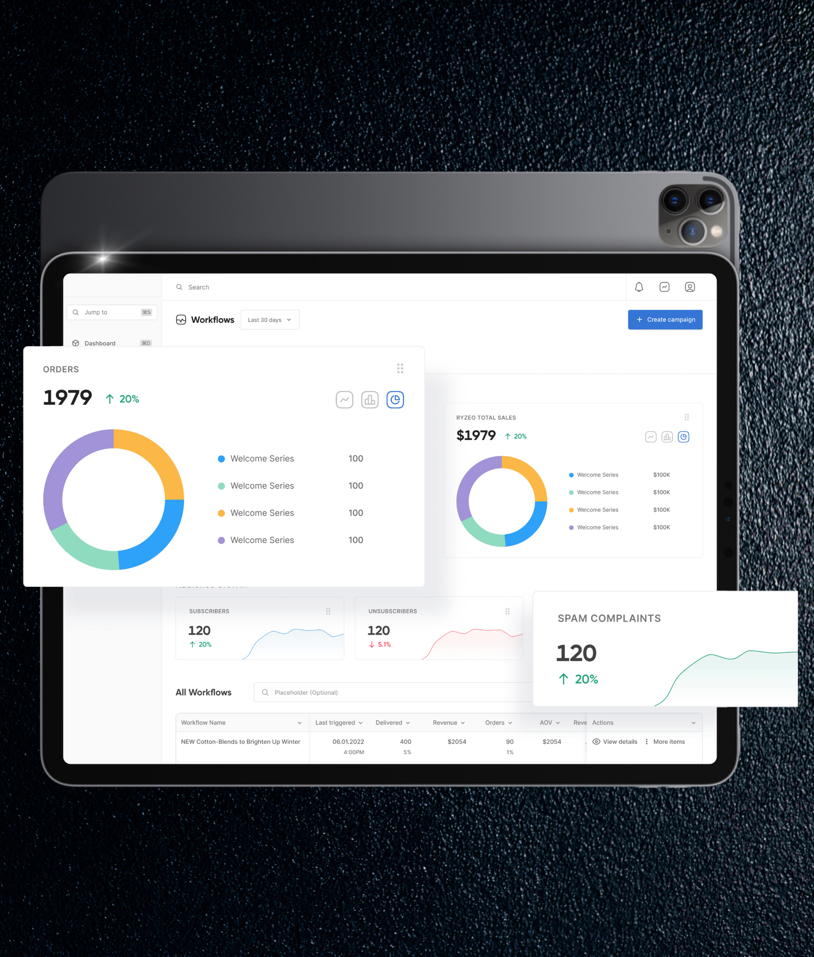
The app screen had two folds: the first consisted of cards that showed actionable insights and key metrics to the users, while the second one with a list of campaign details. This layout was chosen so that users could drag and drop the components within the screen while creating a unique view according to their needs dynamically.
User Feedback
Our design process was iterative and incremental. We seeked constant feedback from users guided by our personas at different stages – starting from IA to final designs. This constant feedback cycle allowed us to iterate the metrics and product’s user experience.
Component-Based Approach

Our design consisted of elements that could be used by different modules. Therefore, we decided to follow a component-based approach. This helped us keep the cost of design low.
While designing the information architecture (IA), we organised the screen elements like metadata, content, and supporting content.
Final Outcome
Design System

In order to create hi-fi wireframes, we developed a manual that included a set of standards for typography and colours. We proposed a design system that was best suitable for an enterprise SaaS product. We used a combination of DM Sans and Inter font families to provide a balanced UI design. Brand guidelines showed colour choices. This helped us maintain design consistency across the app.
We followed minimalism to help our users focus more on the data they were looking at. We used Marine Blue as the primary colour. We needed a neutral colour, like blue, to avoid carrying any positive connotations as green does, or any negative ones, like red, does. On the UI design, we would already be using the greens and reds to indicate trends.
Inter was our choice for the body typeface. It has a generous x-height lending excellent readability for charts and tables.
For headings, we wanted something geometric and something that could be used to have a striking headline. We went ahead with DM Sans for this. Its bolder weights worked perfectly for our titles and headlines across the UI design.
Hi-fidelity Wireframes & Prototypes

After finalising the design system, we started with prototypes.
Prototyping helped us create an experience closest to the final product. It also helped us to identify problems with the usability of wireframes. This gave us the idea turn the tabs sticky on the top while scrolling through, to avoid having users feel disconnected.
Design System Documentation

We created a design document of all the components that we used in the designs. This would make it easier for designers and developers who later work on this system to understand each element of the component. We also organised design components by dividing then into atoms, molecules, compounds, and organisms.
What makes a design system a “good design system” is not just the designs, but its documentation. We documented all design decisions that were tested and validated like
- Information design
- Component anatomy
- Visual design decisions
- Design tokens
- Component documentation
This project helped us to gather a deeper understanding of the enterprise SaaS industry and users. It also enhanced our capabilities as an enterprise UX design company.
If you have a similar requirement then we would love to talk to you and share our experience.